
STRATEGY + BRAND CREATION + BRAND DESIGN + UX/UI
Summary:
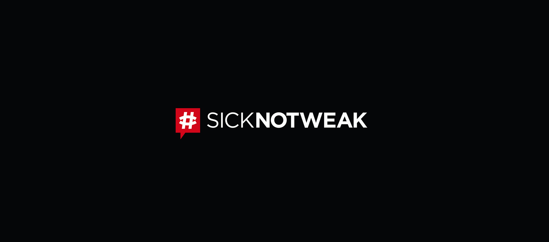
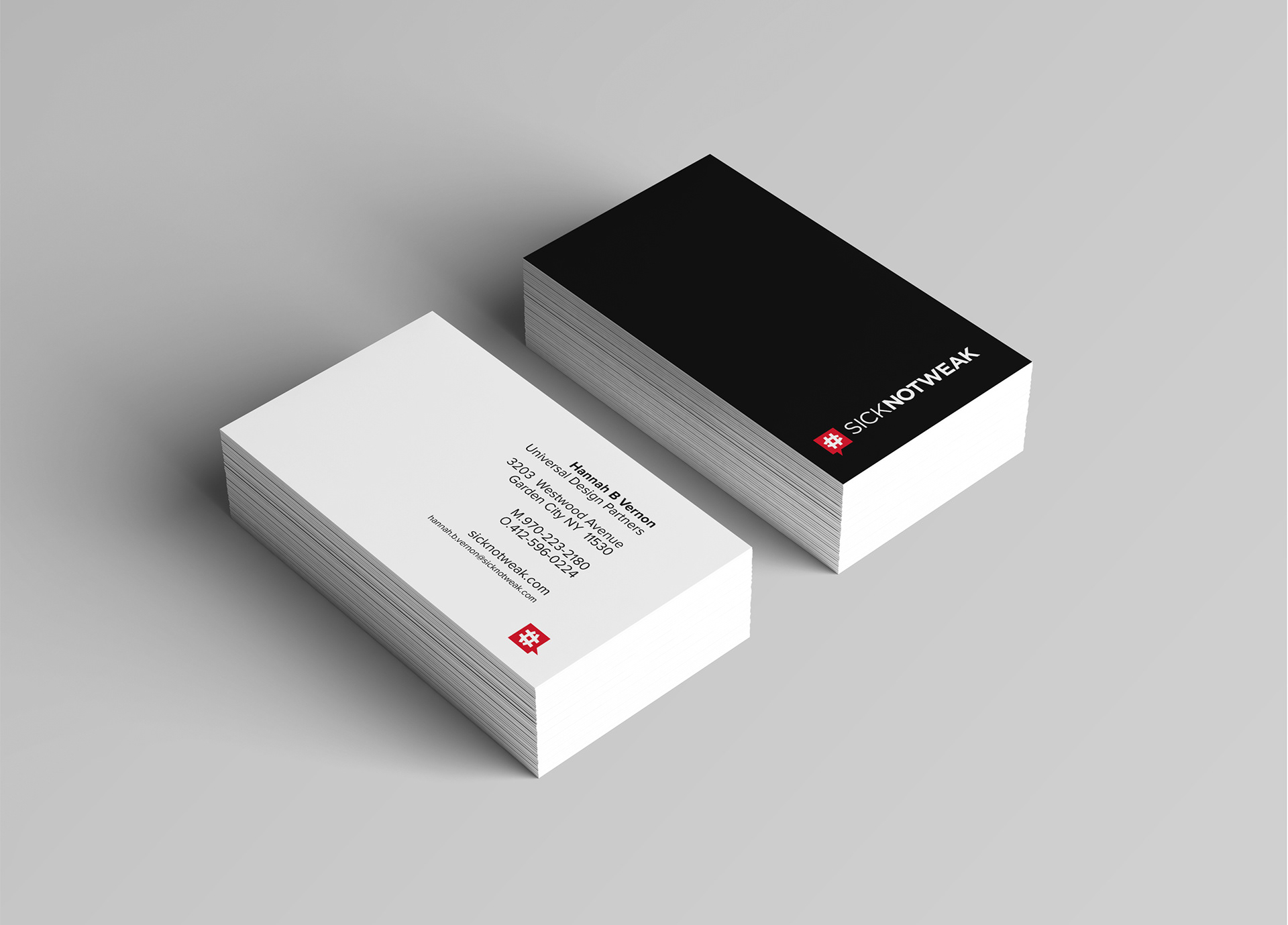
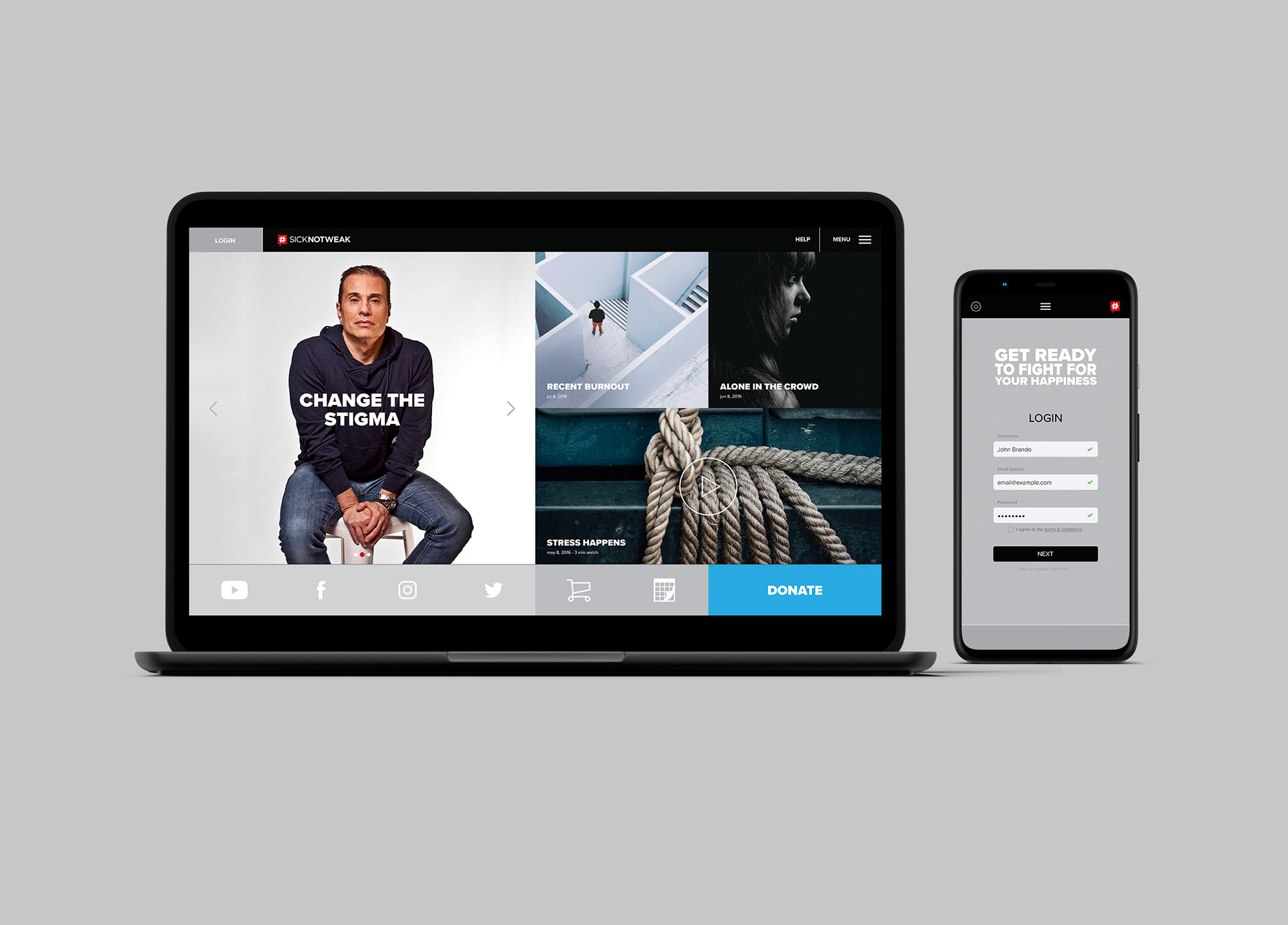
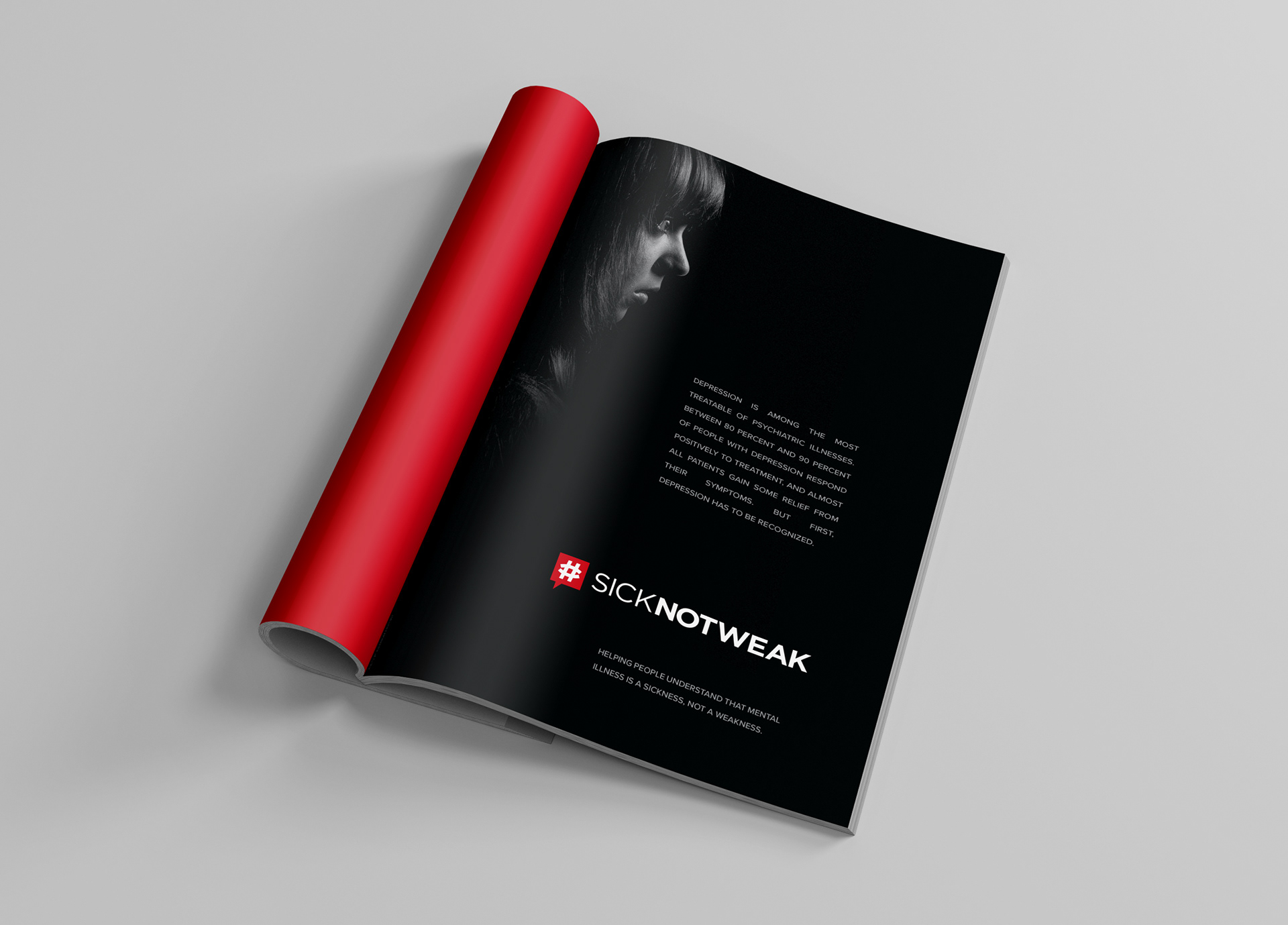
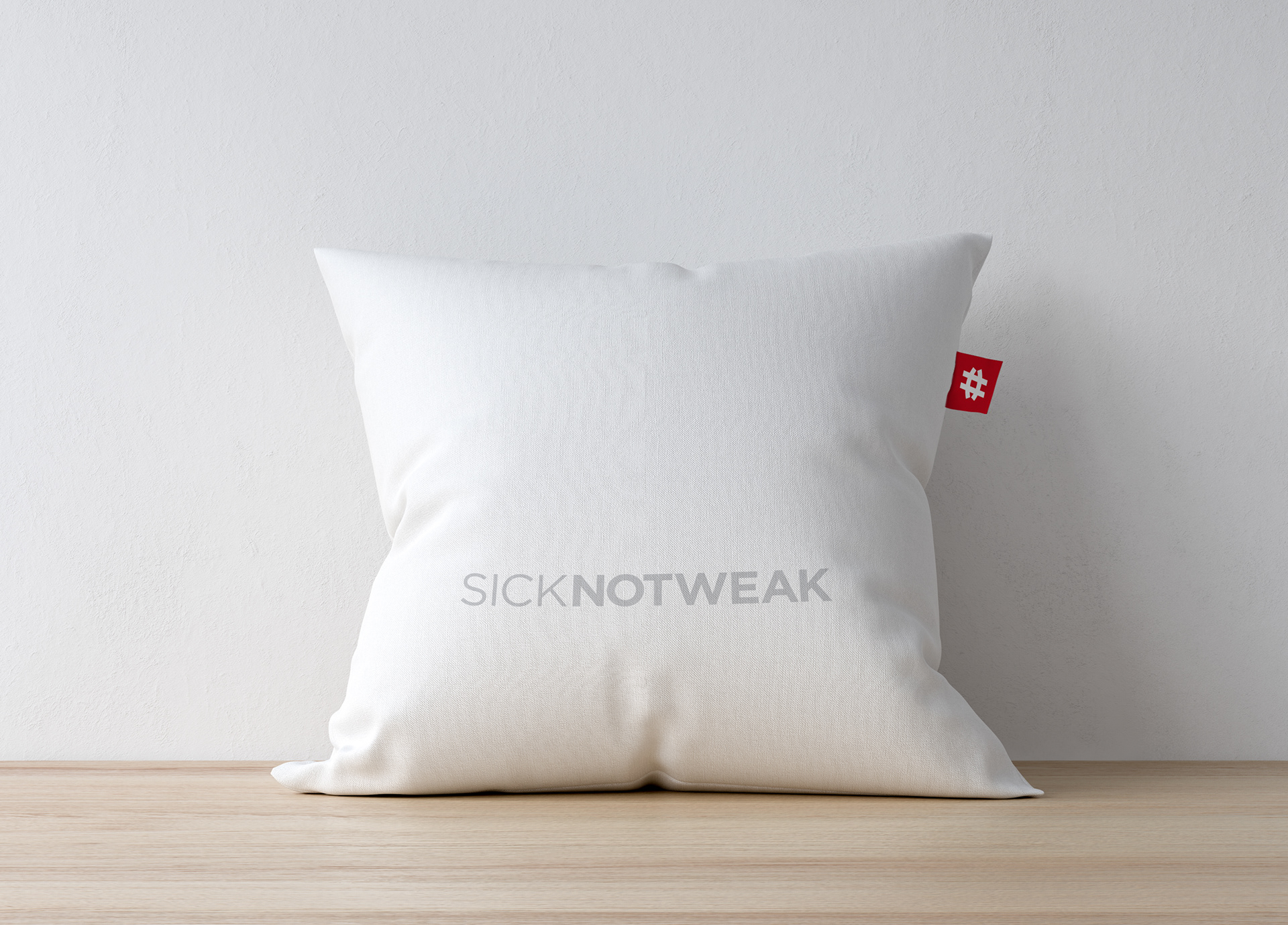
Project aimed was to create a powerful brand identity for sick not weak, and a platform to fight the stigma surrounding mental health. The challenge was to visually represent the concept that i am sick while emphasizing strength through the "not weak" aspect. The solution involved developing a visual language that combined vulnerability and empowerment, with thinner case typography for "sick" and bolder fonts for "not weak." A thought-provoking logo was designed, incorporating a combination of a sad face, smiley face, skewed hashtag, and thought bubble to symbolize the fight against stigma and the need for open conversation. The result was a compelling brand identity that successfully combated mental health stigma, promoted awareness, and created a supportive community. The consistent application of the brand identity across various mediums reinforced the message, leaving a lasting impression on the target audience. Overall, the sicknotweak brand identity effectively communicated empathy, strength, and resilience in the face of mental health challenges.
Concept Launch Tactic:
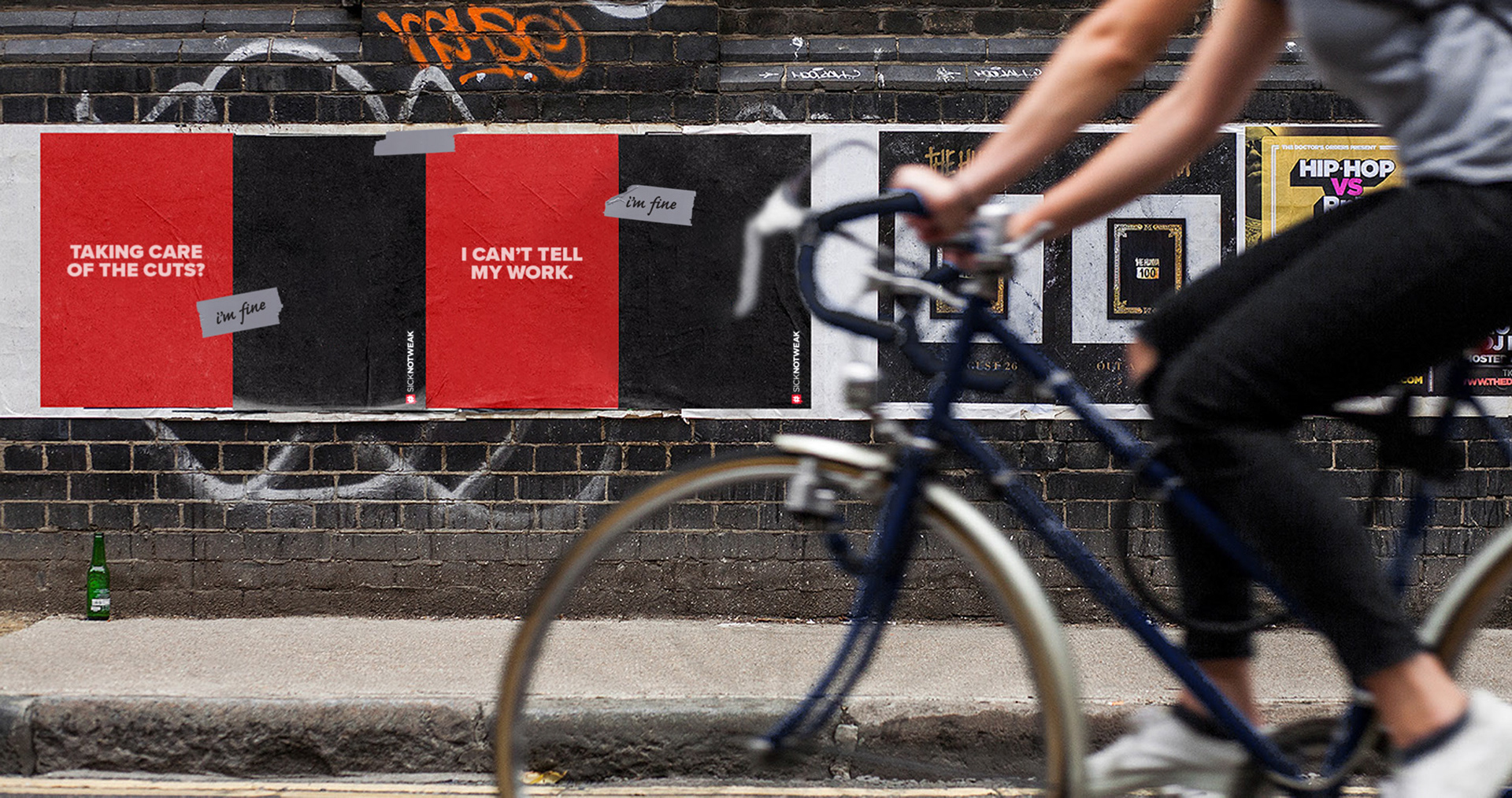
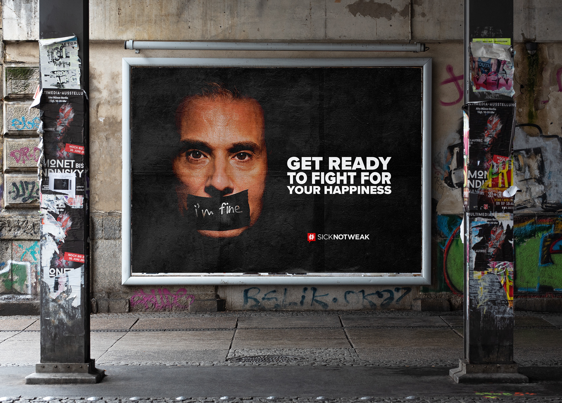
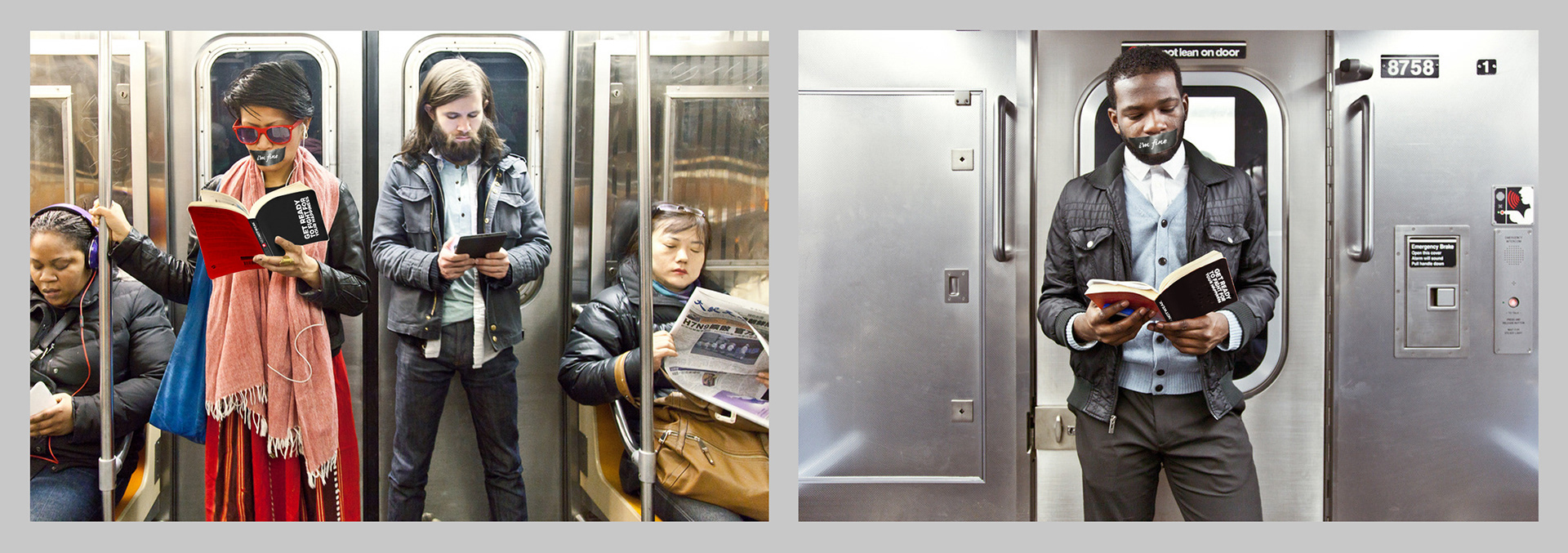
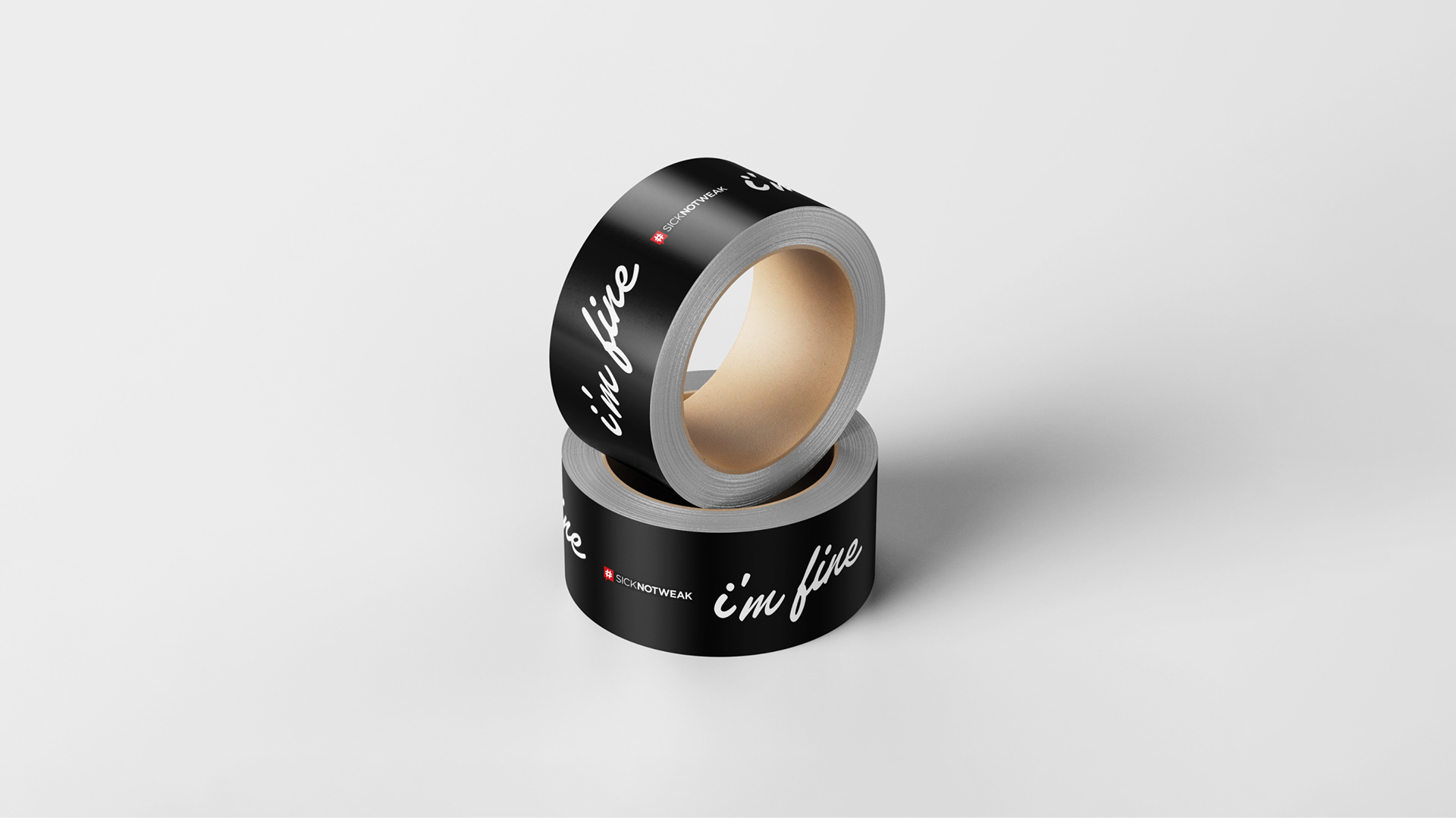
For the launch of sicknotweak, we implemented a guerilla marketing strategy. We would plastered posters, secured with duct tape, across high-traffic areas in the city. These posters would featured the phrase "I'm fine," emphasizing the importance of mental health awareness. To further engage the public, we enlisted actors dressed in white, black, and red-brown attire, with duct tape over their mouths bearing the words "I'm fine."
These actors would be strategically positioned during rush-hour, captivating attention while reading books adorned with the advertising campaign on the covers. This innovative approach aimed to create a buzz and spark conversations about mental health. Additionally, would capitalized on cost-effective measures by utilizing packs of shipping tape for support, optimizing our resources while maximizing impact.