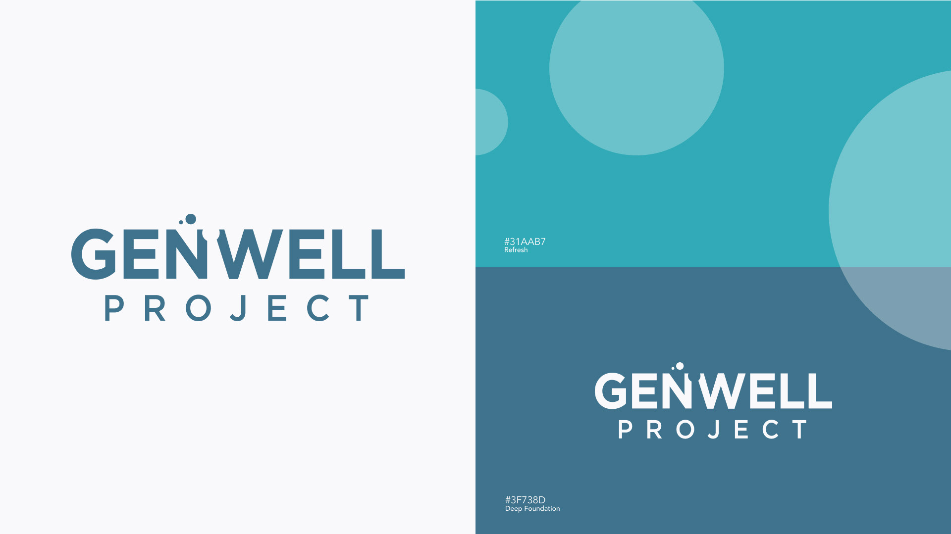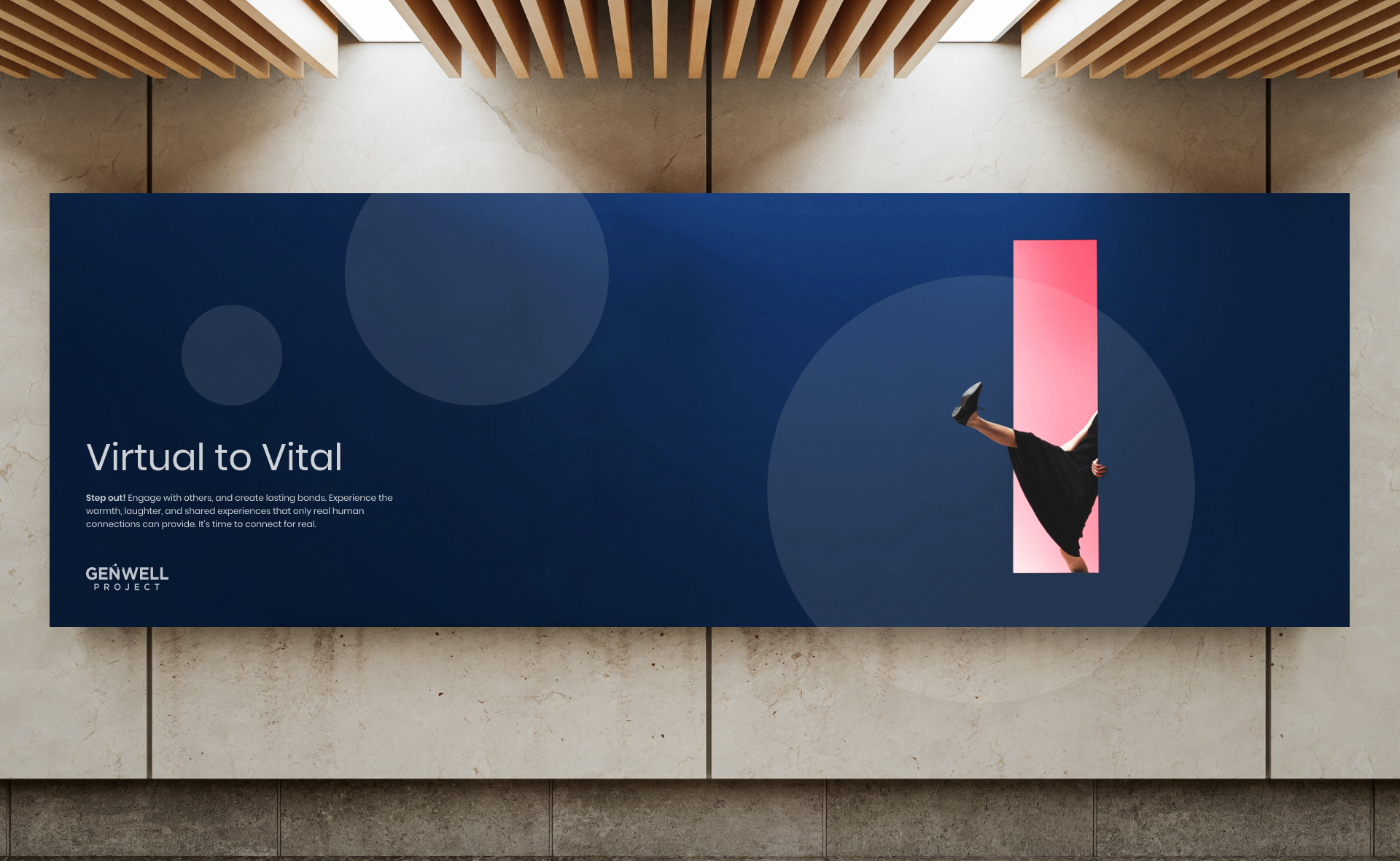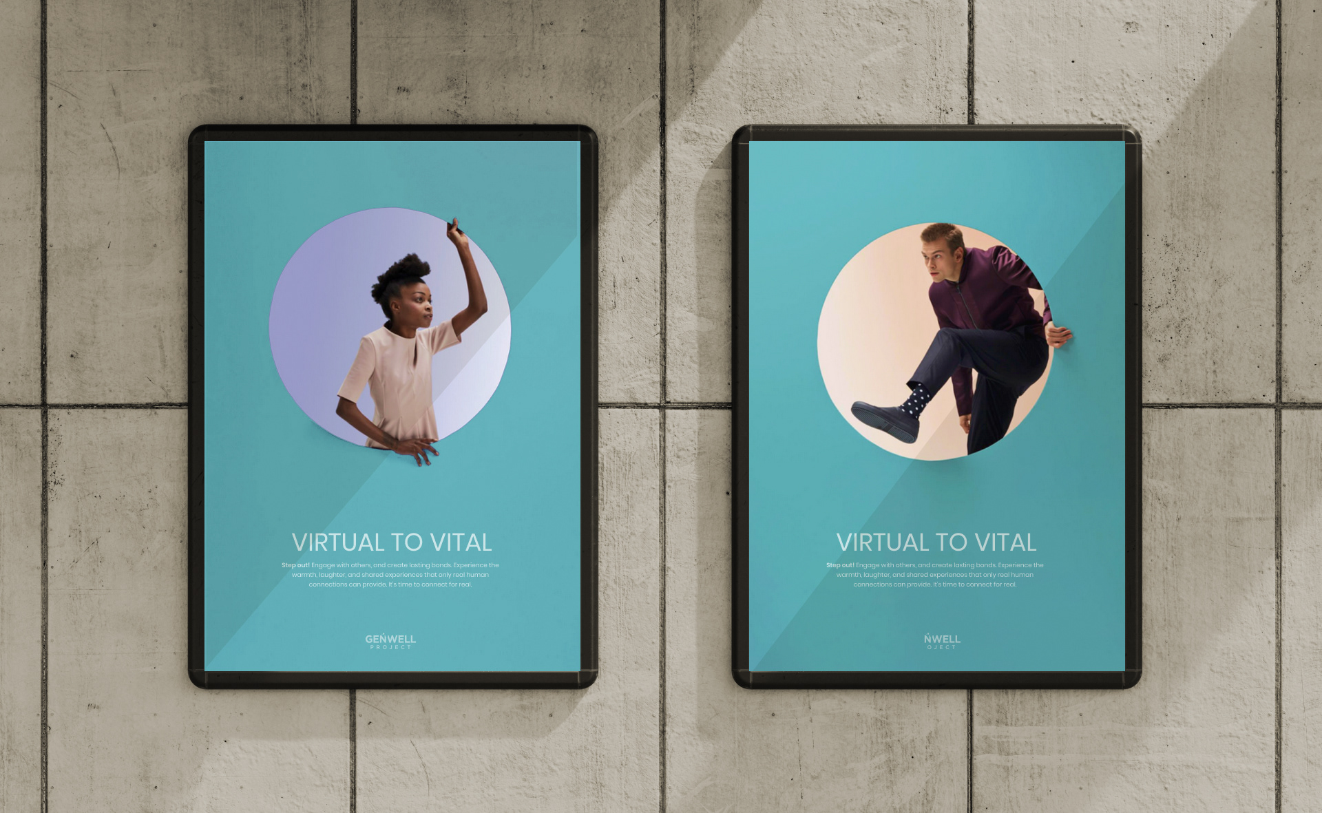

BRAND STRATEGY + CREATION + DESIGN
Logo Concept:
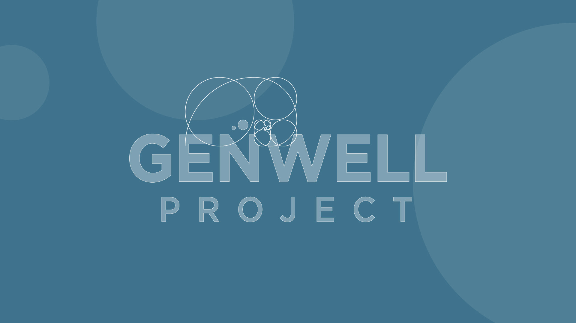
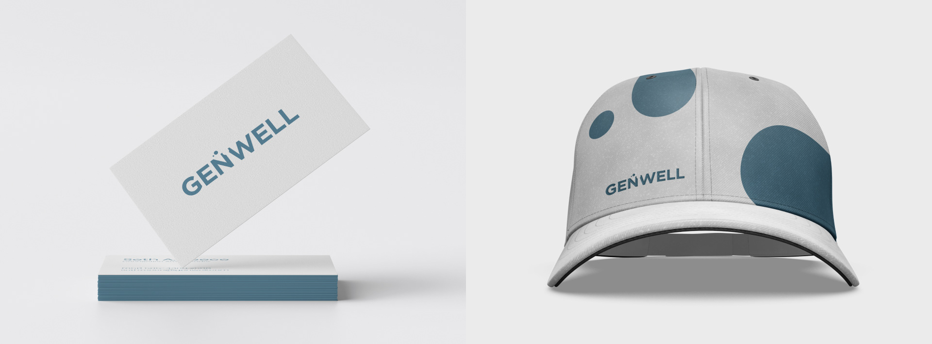
The logo design takes inspiration from the evolution ages of human generations, representing the transition from the agricultural, to the industrial followed by the informational age and the new emerging wellness age. The concept revolves around the golden ratio, symbolizing the fundamental building blocks of life and humanity.
Visual Elements:
Golden Ratio: The logo design incorporates the golden ratio, which is a mathematical proportion found in nature and is often associated with aesthetics and harmony. It represents the inherent balance and order in the design.
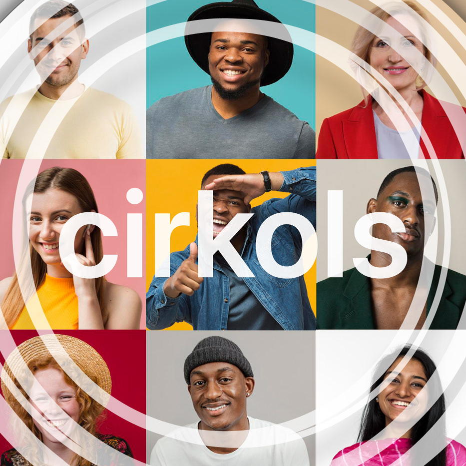
Circles: The logo features three circles, representing past generations. The two circles left of the central empty circle symbolize the past generations. These circles serve as a visual representation of history and the evolving ages.
Empty Circle: The negative circle between the "N" and the "W" within the brandmark represents the emotional wellness age. It signifies a void that needs understanding, empathy, and filling. It reflects the need for emotional connection and human understanding in our evolving societies.
The brandmark communicates progression, movement, connection, and humanity. It evokes curiosity, symbolizing a shift in the way we interact with each other emotionally. The design is visually engaging, memorable, and versatile, allowing it to be easily recognizable across different platforms and applications.