
STRATEGY + BRAND DESIGN
Summary:
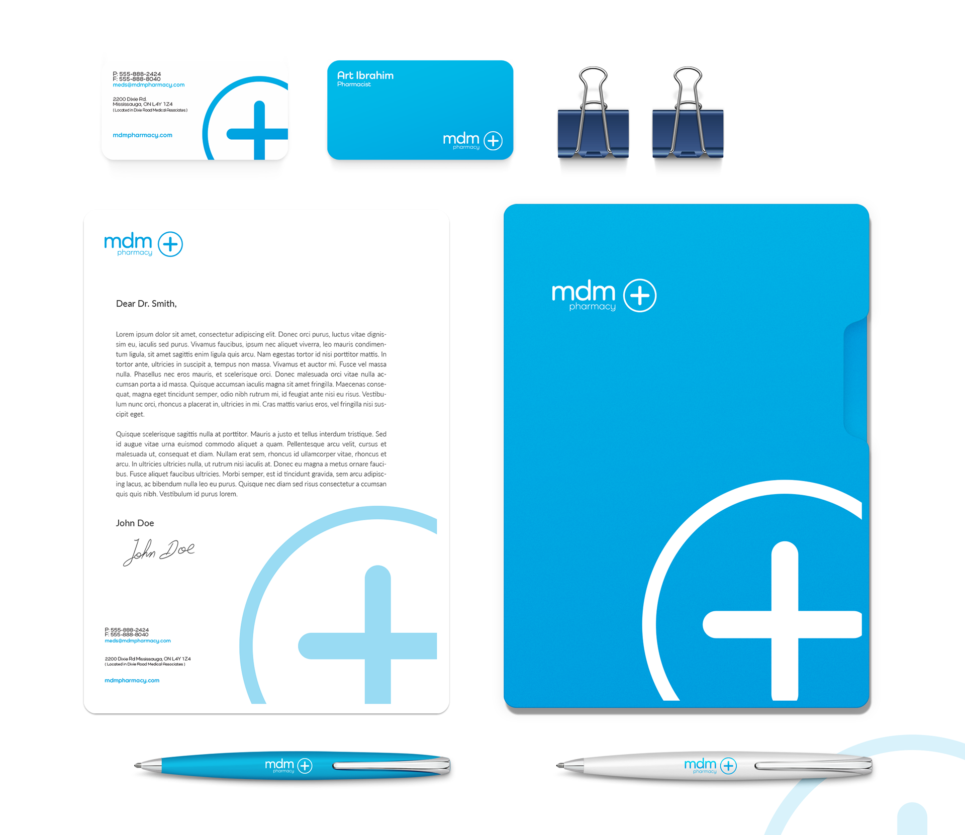
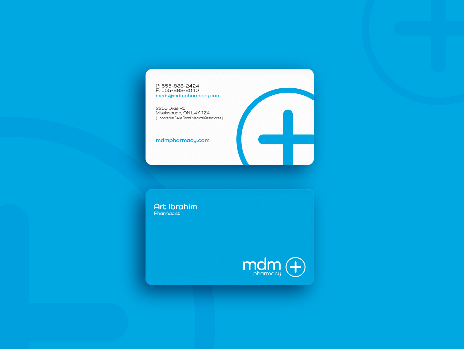
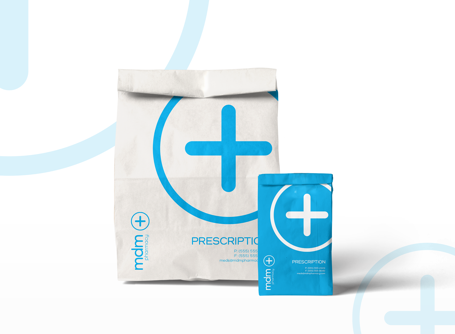
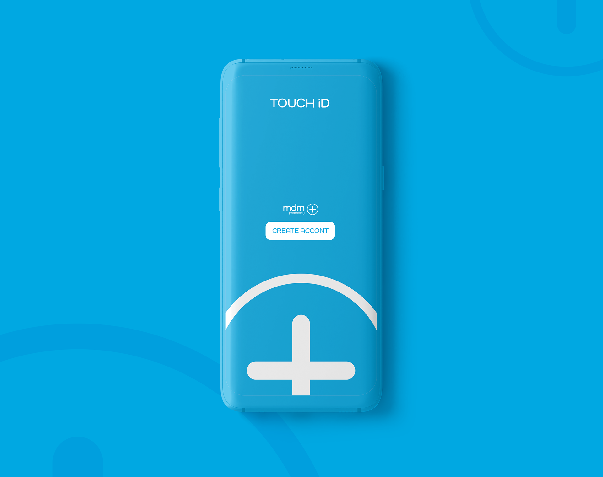
The successful implementation of the brand design strategy for mdm pharmacy has brought about a remarkable transformation, addressing the challenge of establishing a trusted environment for health-related needs and advice. Through a focus on simplicity, minimalism, and the strategic use of the color blue, the brand now exudes professionalism, reliability, and approach-ability. The clean and minimalist logo, harmonious color palette featuring the blue, and carefully selected fonts that instilled a sense of trust and calmness among the customers. An incorporation of a seamless mobile integration, allowing for convenient processing of new prescriptions or refills. This integration enhances the overall customer experience, making it easier and more efficient for individuals to access and manage their medication needs.
The cohesive brand identity, consistently applied across various touch-points, has resulted in increased customer satisfaction and loyalty, positioning our pharmacy as a trusted source for health-related information and medication needs. The scope has paid off, mdm has witnessed a significant increase in customer satisfaction and loyalty, solidifying their reputation as the go-to destination for reliable and convenient healthcare services.